CAMP Fall Art Show

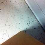
I am proud to say that of the 4 photos I submitted to the fall art show, one was indeed selected and hanging at the CAMP Rehoboth Community Center! CAMP is in downtown Rehoboth on Baltimore Ave and now that the parking meters are down it is the perfect time to check out the beachside town. You may remember this photograph from the Summer Streets exhibit in Newark this past summer. I chose this photograph because it was a favorite.

3
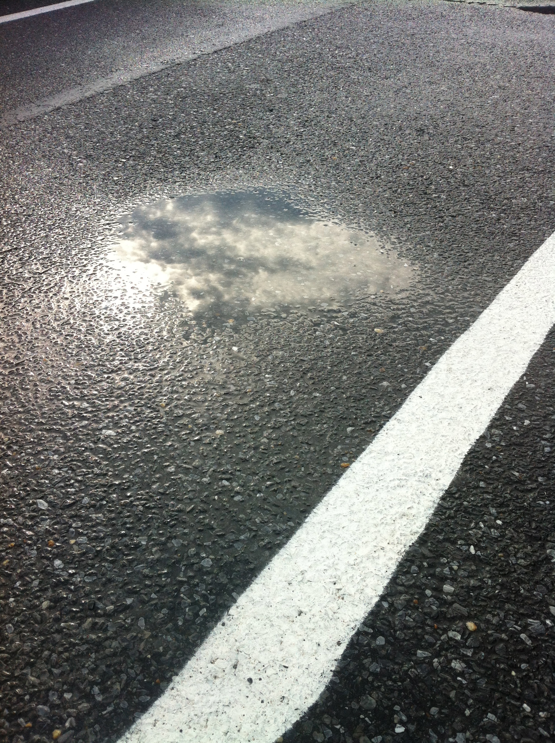
Sun-Puddled Pavement © 2012 NATE METZ $150.00

Check out all the pictures here.

The Gallery is located in the downstairs of the building in the lobby area:

37 Baltimore Avenue
Rehoboth Beach, DE 19971
Phone: 302-227-5620
Email info@camprehoboth.com

I look forward to seeing you at the CAMP Art Show!

John Blocks

Never one to pass up an opportunity, here are some pictures from the beginning of this year:

John Blocks © 2013 NATE METZ


Delaware Artist Roster

There are some days that you just have to take care of business. I find every day that there is another place to get my name out into the “art world” and that I am constantly updating my online presence. The latest installment is a profile on the State of Delaware Artist Roster, part of the Delaware Division of the Arts. I don’t know that being there will necessarily bring a lot of business, but it feels good to be OFFICIAL. It will definitely help with a professional image and legitimacy to my business.

Check it out:

Artist Roster

CHALLENGE: OPPOSITES

OPPOSITES © 2013 NATE METZ

These photographs were all the “rejects” that I did not select for entry in the challenge. I opted for this image of a mushroom because I believe it is much more impactful for the theme of OPPOSITES.

mushroom_DSC_1281
MUSHROOM © 2013 NATE METZ

STATS:
rank = 16th
1/125 sec, f8, ISO 200

I opted for a simple set of opposites shared in a single subject where the frame would highlight the differences. The closeness and color conversion really emphasize the theme. I received some great feedback on how the frame seems top heavy and that the top portion out of focus might have looked better as the smaller 1/3 of the frame. However, I like it as is because in the competition for your eye, it really pushes the oppositional tension between the top of the mushroom and the underside.