Tiffany’s Glass

In addition to the “arctic” lake, I stumbled upon the Willard Chapel on a local tourism site. As I read the blurb, I knew I just absolutely had to go see the splendor!

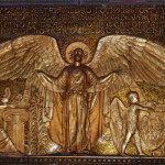
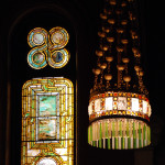
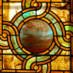
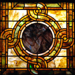
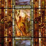
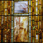
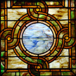
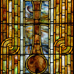
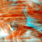
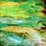
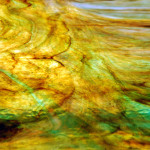
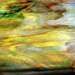
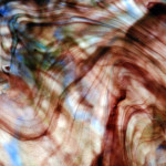
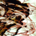
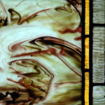
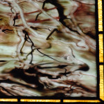
“The Willard Chapel is an extremely rare example of the work of Louis C. Tiffany and Tiffany Glass and Decoration Co. Included in the Tiffany interior are 14 opalescent windows, a rose window, a large figure window, nine Mooresque styled chandeliers, memorial tablets of glass mosaic tile and gilt bronze, furnishings of oak inlaid with metal and glass mosaic, a ceiling with gold leaf stencils and mosaic flooring. Built in 1892-1894, the interior of the Chapel was designed and handcrafted entirely by Tiffany Glass and Decorating Company of New York City and is the only complete and unaltered Tiffany designed religion interior known to exist in the world.”
from http://www.willardchapel.org

We got a private tour of the chapel that last about an hour. It really felt like an episode on National Geographic as we got history of the building and explored techniques and design elements of Tiffany’s glass and other furnishings. The greatest part was definitely the ability to use flash photography! I can understanding some art museums and not allowing flash photography, but any that ban all types of photography are just no fun! I have a couple wide angle shots of the chapel, but these are just the detail shots. I’d recommend seeing the official page for more. And, if you are ever in the Finger Lake region of New York, it is worth the trip downtown Auburn to see this work in person!

BEACH Greeting Cards

Since taking these photographs, I’ve been thinking about printing them on card stock for greeting cards. Living at the beach, it can be a challenge to have beach inspired (or even themed) products to sell that are not super literal: sea shells, umbrellas, flip flops, surf boards, sand castles, etc. When I came across this old wood, it felt beachy to me and the color blocking was already in place.

What do you think? Would you purchase a box set of blank greeting cards with 2 per image?

Beach Blocks © 2013 NATE METZ

SQUARES

If you’ve been following my blog, then you know I love catching life reflections and refractions on the wall. Then, watch them slide around, go out of focus, and disappear.

Here are some squares in the corner:

SQUARES © 2013 NATE METZ

The really fun part about these photographs is the rainbow of color across the images that came from the light refracting through glass. The original, out of camera file looked like white on beige almost. I always double check the white balance as one of my first steps in post processing. Doing so unlocked all the color present in the white light. I know it’s basic science of white light containing all the colors, but nifty none the less!

Here is the original photo for comparison:

raw SQUARES image

PAIRINGS

The Rehoboth Art League is running a monthly series of pairings where members are invited to submit recent work to be displayed in the gallery with works from the collection. When I first heard about it, I glanced through the works and found nothing inspiring. About a week ago, I got an e-mail reminder saying that they were still taking applications for December, so I took another gander. This time two of the works stood out.

So, then I went through my framed work from the past 2 years and opened .jpgs on my computer along with the two images from the collection–about 12 total images on screen. I left it open for a couple hours while I worked on some crochet projects and paperwork. One by one I dropped out images and enlarged the remaining ones until I had my final selection.

Here is my proposal:

leach_ethel_p_b_corner_market_david_350
Corner Market and David © Ethel P. B. Leach – Oil on masonite

Parking for Candy Only © 2012 NATE METZ
Parking for Candy Only 1 © 2012 NATE METZ – digital photograph

These two works come together as depictions of street life, titled appropriately to indicate the urban setting. However, it is their perspectives of the city that differ the greatest. Leach’s perspective is scenic of a corner at an intersection. Metz on the other hand is a macro work of still life. Although both highlight a study in forms where multiple rounded organic shapes in the foreground contrast against strikingly sharp, linear angles and planes in the backgrounds.

The tones differ as well. The feel of Leach’s painting is decidedly warm and friendly with subdued earthy tones and a brown-colored street. Metz’s photograph depicts a much starker street in the black and grey tonal blacktop aggregate. Metz’s street also has a much higher contrast in color with the bright candy floating across the surface to further differentiate the tonal variance.

The differences in feeling originate with the medium: Metz’s more modern work is a digital photograph and Leach captures a nostalgic moment in the traditional oil painting. The cooler emotional response to Parking for Candy Only could also be to the lack of human and canine pedestrians that are present on Corner Market and David.

Coming back to the perspectives of each, we can explore the points of view. In Leach, the reflections on the windows and the streets allow the viewer to examine different parts of the work. Also, the direction of each person’s face and canine gait allows us to ponder the various perspectives of the piece. Metz’s digital photographs, though, require three different frames to explore the various angles of the subjects. Each photograph allows the viewer to ponder a different perspective.

Word Cloud

June 2013 cloud

It’s been a while since I posted one of these. I think word clouds are a neat way to see how much I really do talk about the things I think that I’m always talking about. The words first, idea, nate, metz, art are not surprising at the top of the list. Noticeably smaller is photography, which is my main mode of art.

MEMES

I’ve tried my hand recently are creating internet memes. I often post images on Facebook with inspirational thoughts. So, I thought why not put the text on the images and share it about!

BLOG CIRCLE: Photo Display

I expressed interest in joining the blog circle because I display pieces of my work in my house that hold great importance to me. They are photographs, paintings, and collage that reflect my spiritual journey as an artist. This work is found on the walls of my bedroom and at my altar where I meditate. The initial call for entry that I saw on the Delaware Photographers Network asked for us to share how we showcase our work in our homes. Today I realized that I had joined a circle of photographers specializing in Family Portraits! So, while we coo over everyone’s beautiful families and friends today, I share with you some displays of a different kind of family. I cherish my work as offspring from my intuition and inspiration. I hope you enjoy:

The next blog on your journey belongs to Theresa and will take you to Southwestern USA. She specializes in natural light family photography. Check out Creative Flair Photography here:

http://www.creativeflairphotography.com/blog/

And, thank you Erin for organizing the circle!

DAMN GOOD ADVICE – TEN

It’s not very often that text, copy, or any sort of word makes a statement in my photography. Alphanumerics tend to be incidentals.

Behind the work is a different story, though. My favorite brainstorming is mind-mapping: connecting words and phrases in a correlative spiderweb of an idea. Most recently, my idea is translucency. While looking at my photographs in that body of work, the word comes to mind in a subtle way. This use of words is different that the advertising described by George Lois.

The idea that really stands out to me in reflecting on Lois’ first commandment in relation to my own work is the interplay between words and images as a form of communication. Even if my photographs do not include words, when we view them we think in words. There is a translation that occurs when viewing art. Because to say, write, or otherwise express our reaction and feelings about one of my photographs we use words. Furthermore, anytime I submit a body of work I am asked to include an artist statement: words that describe the visual image. At first, I dread writing down the words that would appear to seal the fate of the associated photographs. As I work through my writing process, I try very hard to maintain a sense of open-endedness. My interpretation in the artist statement is never designed to me the final comment.

So yes, the word does indeed come first.

WORD © 2013 NATE METZ

mistakes

MIS-TAKES © 2012 NATE METZ

I’ve been think a lot about the ideal of perfection and making mistakes. I was sharing a story with another artist on Facebook about how I never delete any photograph that I take. Never ever. I often will flip through old files and see something new in a picture that had previously not met focus, or something that I can manipulate into some great digital art, or sometimes a little heavier post-processing can add a selling touch. All of the images above never were posted in their original state; they were the rejects. Until now.

Coincidently, I saw this video on my YouTube feed the same day:

Some key takeaways for me:
**Fear of making mistakes can cause us to never take action at all and never try.
**Everything is an opportunity to learn and to grow.

I can honestly say that some of my favorite photographs were not a result of me walking outside, turning on my camera, pushing the shutter button once, and uploading that image as a final print. Never ever. Looking at my mis-takes is precisely how I learned photography. I have not taken any coursework on photography or cameras. With the shutter, aperture, ISO, and other settings I took a lot of mis-takes to learn, and I would say that the same true for those with a degree. I believe that mis-takes aren’t even mistakes because they are exactly as intended. It’s up to us to change our perspective to see what we can learn from our rejection of something we created!